You’ve been writing blog posts for a while now like a chimp on a Kitkat sugar rush.
And you feel it’s time to showcase your expertise and build your legacy so you buckle down to write your first eBook.
You’re confident because, at the end of the day, you know your niche and your topic well enough to write an eBook that will help your readers and grow your business.
After spending weeks writing your eBook and working on your launch strategy, you realize that you need to write a sales page for your eBook that converts readers into customers. Now, you’re not a marketing expert or a copywriter to write a bangin’ sales page.
And you certainly don’t want to spend a fortune on one especially when you’re just starting out with your blog.
You’re stuck.
No amount of coffee or inspirational quotes have prepared you for this.
Don’t fret. It’s one of the harsh truths about blogging. You can have the best eBook in the world, but if your sales page is just meh, you’re going to lose a lot of potential customers.
Your sales page needs to hook your readers and keep them reading until the end.
And no, you can’t just wing it.
That’s what I did at first, and my sales reflected the effort I put into my sales page – they were decent but meh.
However, last month, I finally decided to get off my lazy hide and tweak my sales page for my Blog Traffic eBook.
And would you believe it? I saw a huge increase in sales!
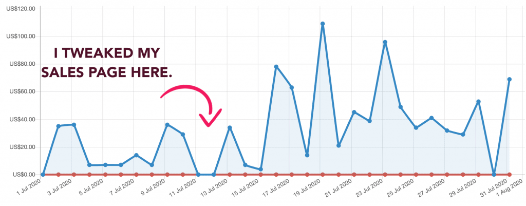
Look at all that cashola I made just by tweaking my sales copy.
And in this post, I am going to reveal my top secret not-so-secret process for writing a sales page for your digital product that wows your reader and has them scrolling for more!

Before I get started, I want you to download my top of the line Sales Page Template. This will help you craft an extraordinary Sales Page for your eBook. You’re most welcome.
This post includes affiliate links to products I truly (from the bottom of my heart) recommend, meaning at no extra cost to you, I may earn a small percentage which I will use to feed my sweet, adorable pooches.
I’m going to be covering a lot, so use the index to skip to whichever sections you want to cover first.
What exactly is a Sales Page?
This is the page that describes your eBook to your reader. And it has only 1 goal: Convince people to purchase your eBook.

Sales pages are used for all kinds of products or services but they fall into mainly 2 categories:
-
- Short-form sales pages
- Long-form sales pages
Short-form vs long-form sales pages:
A short-form sales page is anywhere between 200-500 words whereas a long-form sales page is 800 words and beyond.
Short-form sales pages are usually used for eCommerce or retail. If you have a simple product and your potential buyer just requires the facts about the product, then a short-term sales page works best.
For instance, when I was buying my 2020 planner, I just needed to know:
- What it looked like inside
- If it had a weekly and monthly spread
- How many sticker sheets it came with
That’s it. In this case, short-form sales pages work best!
And this is what it might look like:
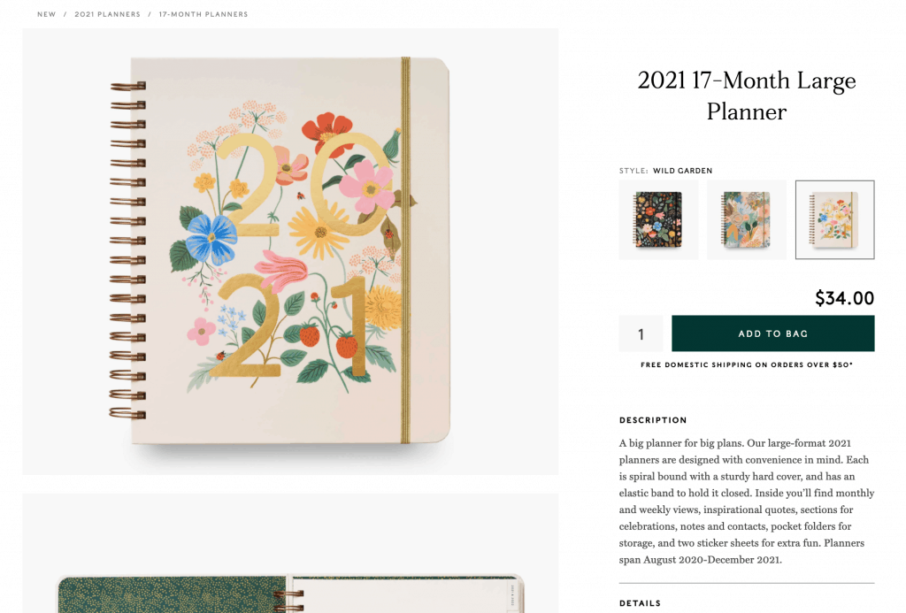
Here is the planner and sticker collection I got for 2021 if you’re interested.
However, if I was investing in a big eCourse that’s priced over $100, I’d need to know a lot, lot more.
So, when you’re trying to convert cold leads who have no clue about you or your Brand, then long-form sales pages are the way to go.
Needless to say, your Sales Page comes at the very end of your sales funnel and is responsible for your readers’ decisions and conversions. So, you need to be on top of your game.
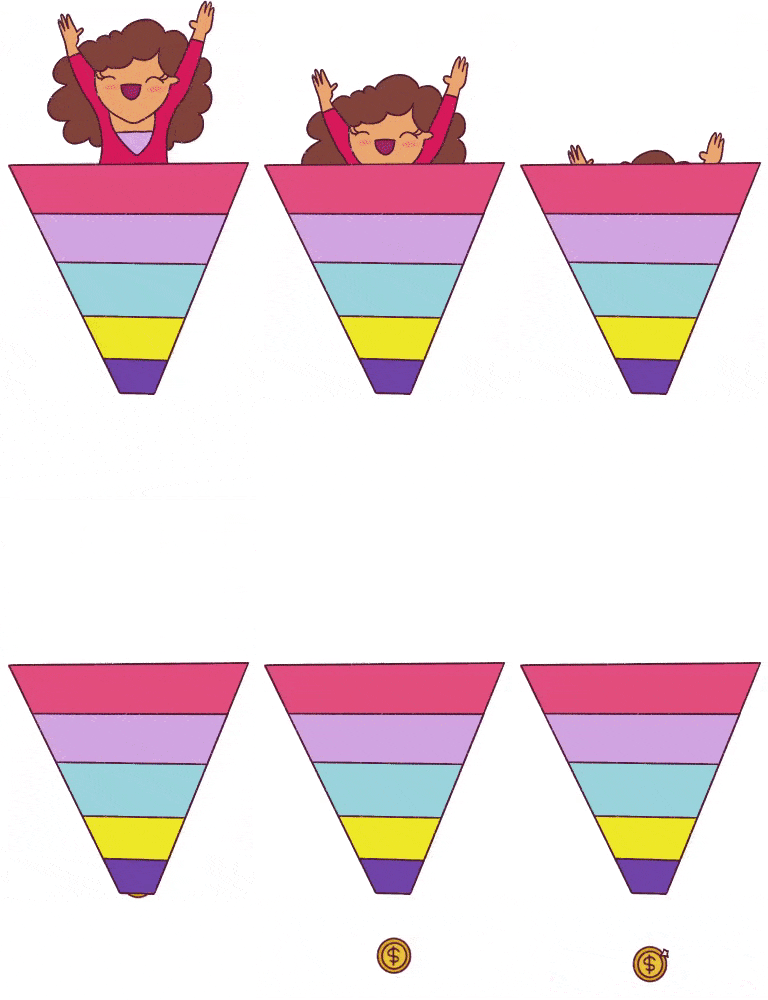
Here are the factors you need to consider when choosing between a short-form or long-form sales page:
- Is your product simple or complicated?
- Are you trying to convert cold leads or does your target audience already know who you are?
- Is your product on the lower-end like a mini-training or an eBook or is it a premium product like a full-fledged eCourse?
Based on these factors, you can choose to go with a short-form or long-form sales page.
What is the difference between a landing page and a sales page?
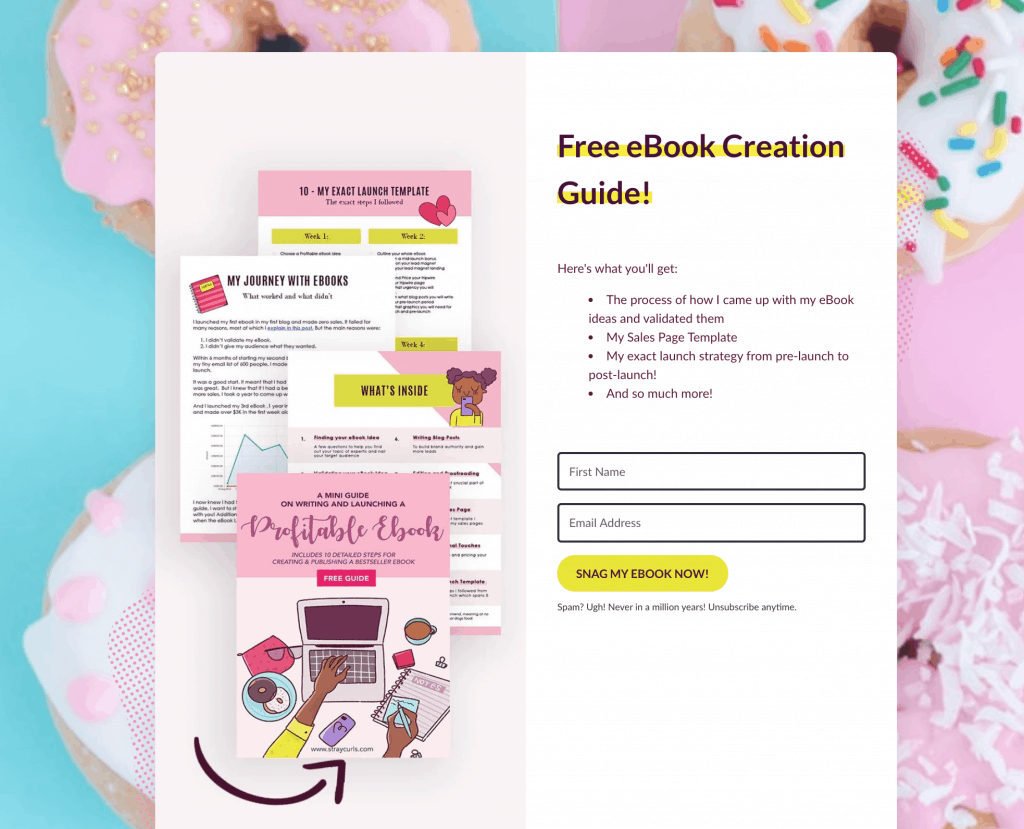
The main goal of a landing page is to collect leads or email subscribers. Mainly, landing pages are used to build your email lists.
You can offer a freebie in return for your reader’s email address like:
- A Checklist
- An eBook
- A mini video training
- A Planner
This is an example of a landing page I currently have where I offer my mini eBook creation guide in exchange for my reader’s email address:
However, the only goal of a sales page is to turn your readers (whom you’ve been nurturing over a while) to customers. That’s pretty much it.
Before I get down to the nitty-gritty of building an extraordinary, non-sleazy sales page, there are 4 things you must understand about copywriting and design.
This is crucial if you want to nail your message and write a high-converting sales page.
What you need to know before building your Sales Page
1. Know who your target audience is
If you do not know whom you’re writing for, your sales page is not going to convert people to buyers. That’s the sad truth. When your readers are reading/skimming your sales page, they should think, “Wow, it’s like she’s reading my mind…”
You need to use the words that they use. You need to understand how they feel.
To do this, you must know:
- What are the pain-points of your target audience?
- What is the main problem that you are trying to solve with your eBook?
- Why haven’t they been able to solve that problem? What’s holding them back?
- What is the outcome of your eBook?
- Where do they hang out? Which social media are they using? What keywords are they entering in Google Search?
- How will they find your eBook?
- Why should your target audience purchase your eBook in comparison to others? What is your Unique Selling Position?
These questions will help you understand how your target audience thinks and will help you write a yummy sales page.
You need to remember that your sales page isn’t about you, even though your prime motive is to sell your eBook. Your sales page should be about your reader. You need to acknowledge your readers’ problems and show them that your solution is exactly what they need.
2. Know your USP – (Unique Selling Position)
Your idea isn’t unique. The eBook you’re writing has probably been written 3-10 times before by other Bloggers. Know how you stand out. Understand how you are different. This will help you write a sales page that sells your eBook like hotcakes.
You should be able to describe your offer (your eBook) in 2-3 sentences.
For instance: My eBook helps (target audience) to (main objective). Unlike most eBooks, it (your point of differentiation).
My Traffic eBook helps young and bright entrepreneurs skyrocket their blog traffic. Unlike most eBooks and eCourses, it focuses on gaining right kind of traffic – the traffic that leads to sales and clients.
Just doing this will help you build your sales page faster!
3. Aim to be clear, not clever
Your sales page needs to be easy to read.
The more complicated it is, the harder it will be for your readers to understand. And when that happens, they’re going to click away. Sort of like when that Math teacher in college kept rambling about derivation and integration and you lost her at the first sentence so you dozed off.

Remember, your aim is to hook them and keep them reading.
We live in a day and age where patience runs thin and people are used to getting everything in a second’s notice.
The second they land on your Sales Page, they need to know what your eBook is about.
So, don’t beat around the bush. Get to the point.
Here are a few ways to do that:
- Use simple words. Don’t try to over-complicate things.
- White space is your friend. A lot of people are reading your sales page on their phones. Break large groups of text with images and videos.
- Use captivating and sharp headings and sub-headings. These are for skimmers who love to scroll faster than you can say “cheese cracker.”
- Use bulletin points. Heavy paragraphs and sentences will tire your reader. Use bulletin points wherever necessary.
- Make it mobile-friendly. Bluchic has a lovely eBook launch template you can use!
4. Write for skimmers and avid readers
You need to understand that not everyone loves reading. A lot of people skim through posts and pages. You have to write your sales page for avid readers and skimmers.
So, how do you do that?
- Use lots of catchy headings and sub-headings.
- Focus on the benefits, not features. Instead of saying, “You’ll learn how to implement SEO on your website.” you should say, “You’ll learn how to implement on-page SEO so that you’ll rank on the front page of Google.”
- Write in a friendly, casual tone. Your readers are human and so are you. There’s no need to be mechanical and formal. Show them just how approachable and warm you are.
- Use lots of pictures of mockups. If you’re creating an eCourse or an eBook, make sure you use plenty of mockups to show your reader what they’re getting. This sweetens the deal.
- Make sure you add your Purchase button after every few sections. You don’t want your readers scrolling up and down to find it.

My Sales Page Formula
Okay, let’s get down and dirty with my sales page formula.
1. A zappy and captivating headline and subtext
Your headline should be extremely gripping and make your readers want to read more. At the same time, a person reading your headline should know what your eBook is about immediately.
Ana from the She Approach has written an eBook that targets any Blogger who wants to grow their traffic via Pinterest. Here is the opening headline on her sales page:

Or take Elna’s headline who targets anyone wanting to make a full-time income by becoming a freelance writer:

Did you notice?
Both headlines immediately tell you what the outcome of their paid product is. Throw the guesswork out the window by being crystal clear about the outcome of your eBook.
2. List out their pain points in their language
In this section, you need to empathize with the reader and show them that you feel their pain.
This is how I do it in my Evergreen Sales Funnels eBook page:
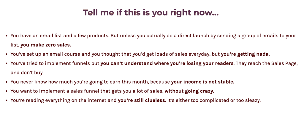
Your goal here is to stress on their pain points.
3. Introduce your eBook as the solution
Now that you’ve gone ahead and listed all the pain points that are eating at them, you need to introduce your eBook as the solution.
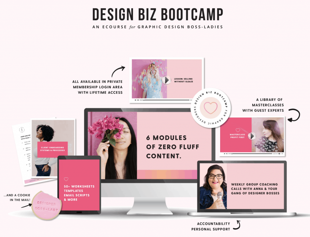
Make sure you include a nice mockup of your eBook. Both open and closed. This helps the reader visualize what they’re going to get. Mockups are an excellent way to tease or tantalize your reader. It’s sort of like going to the mall just to look at the pretty window displays.
I love how Anna Dower shows a mockup of her eCourse in Design Biz Bootcamp.
Or how Mckenzie does this with her Blogging Mentor eBook:
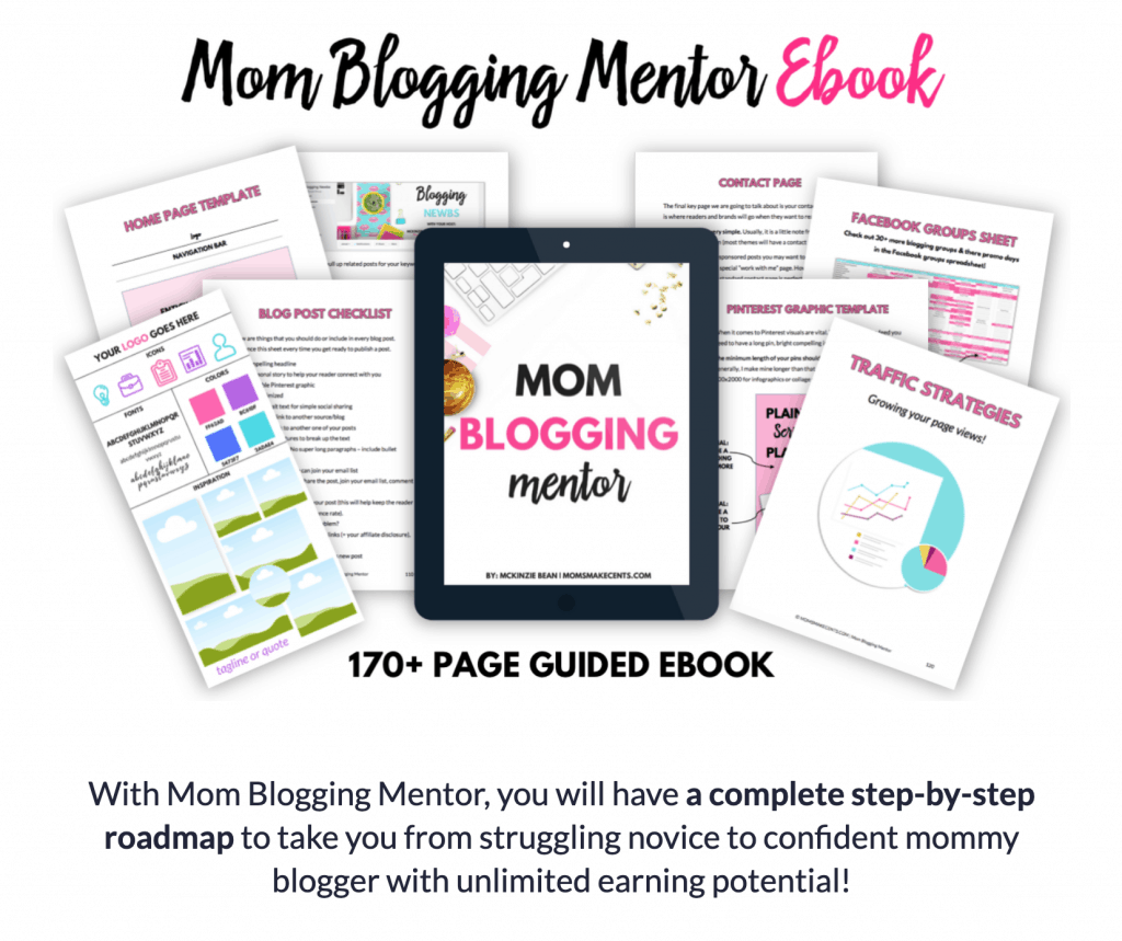
Also, notice how she includes several mockups of all the exciting worksheets and goodies that a reader will get if they purchase her eBook?
Discuss the main takeaways of your eBook. Don’t go into detail at this point. You don’t want to overwhelm them.
4. Tell your story + Why should they care?
In this section, you need to introduce yourself. The idea is to show them that there is a real human being that’s written this eBook.
Talk about your personal experience and how implementing certain strategies helped you get the same outcome that your eBook is going to teach them.
Show proof to make your story more convincing. If you’re showing how your traffic strategies helped you grow your traffic, show screenshots of your Google Analytics.
If your meal plan helped you lose weight, show before and after photos.
Pamela Espino shows you exactly what you’ll learn after you take her Digital Character Illustration Online class.
(P.S. You can use the STRAYCURLS-10 coupon code to get an additional 10% off!)
If you’re going to teach them how to use journaling to elevate their moods, include photos of your pages to show them your journey and photos of yourself now.
Explain how it took you months/years to come up with this strategy and this eBook will save them so much time to get the results they are looking for.
5. Give them a detailed description of your eBook
This is where you lay it all out for them.
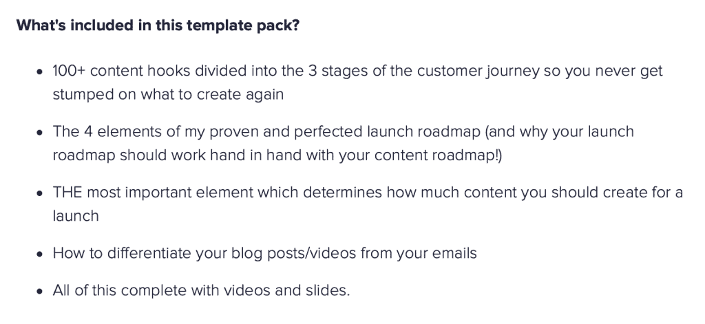
This section is very important because you need to show the reader how your product will help them. They aren’t interested in how many chapters you have. They want to know how it will benefit them, how their lives will change after buying your product. The best way to do this is to break down each important chapter into 3-4 bulletin points.
If your eBook is small, then you can short-list the benefits to 6-7 points. Meera does this perfectly with her Ultimate Content Marketing Toolkit:
6. Include Testimonials to build trust
Testimonials offer proof that your eBook has helped other people in the same league combat their problems. If you have a Facebook Group, you can even add snippets of people’s comments to your sales page like how Tracie Forbes does.
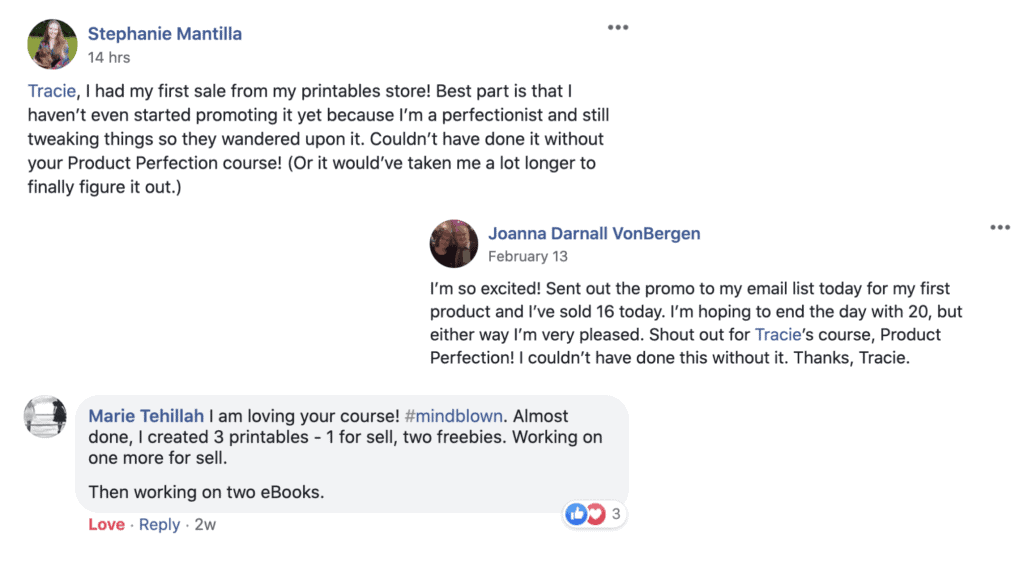
If your eBook is new and you haven’t launched it yet, offer your eBook for free to peers/people who love your brand in exchange for a testimonial.
This is what I did for my first eBook. Once someone buys your eBook, you can send a follow-up email 10-20 days later asking them for a review. You can offer your buyers a small bonus (available nowhere else) in exchange for their testimonial.
Apart from including testimonials and reviews, you can also include logos of reputed brands that you have worked with or have endorsed your eBook.
7. Add bonuses to sweeten the deal
I’ve recently been buying my breakfast from this cozy cafe called The Daily Bean. On the 3rd consecutive day of ordering from them, I got a free sausage roll. And boy, was I pleased! I’m now a regular customer because they reward me for being loyal to their brand. And also because their food is delish.

Please excuse me, my mouth is full…
Likewise, nothing beats the joy I feel when I skip to the Starbucks counter to claim my free drink after gaining 10 stars.
In short, Bonuses count.
So, think about what bonuses you could include to sway your readers into buying your eBook! Is there any way you could enhance your reader’s journey by offering a free template, workbook, roadmap, or spreadsheet?
It doesn’t have to be complex.
8. Include an FAQ section to overcome nagging doubts
People always have questions that prevent them from purchasing. Your job is to predict these questions in advance and show them that the risk is minimal.
Make sure you include information about the digital nature of your eBook (a lot of people get confused between physical and digital books) and mention what format they will receive it in. Doing this will help avoid a lot of confusion and your readers won’t expect a physical copy to be shipped to them.
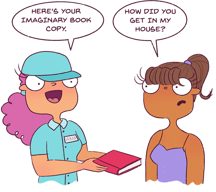
Include download instructions to help bring more clarity to their buying process.
9. Paint a rosy picture of the outcome
In this section, you want to paint a picture of their lives after they implement the steps in your eBook.
If you were selling an eBook on combating stress via journalling, you could say:
- Imagine going to the office in a happy mood every day.
- Imagine being able to focus on whichever task you perform.
- You will know how to tackle every problem you have with a clear and focused mind.
10. Add your call-to-action button
Instead of using the words, “buy now” or “purchase” include words like “Yes, I’m ready” or “Yes, I’m Convinced!” These words help push your reader to take action.
Make sure that your purchase button is a nice bright color. Bright green works.
Once you write your sales page, leave it aside for 2-3 days, and get back to it with fresh eyes. You may get more points or feel the need to edit what’s there.
Best practices when building a Sales Page
Now that you have a nice sales page formula to follow, there are a few additional tips you should keep in mind before writing your sales page.
- Eliminate all distractions: Remove all your headers, footers, and external links from your Sales Page. The main purpose of your sales page is to make the sale. You can’t have your reader clicking away from it.
- Include a heading/subheading every 2-3 paragraphs: As I mentioned before, large paragraphs can bore your reader especially if they’re reading it on the phone. Resources to help you build an out-of-the-world sales page:
- Include pictures and highlighted text wherever possible: If your sales page is a long-form sales page, you should include more pictures and mockups to showcase your product in bright light. For instance, take My Emma’s Home Page which also works as a sales page. They’ve included loads of illustrations which are super adorable.

Tools I use and highly recommend:
Only when I started spending on my Blog and started treating it like a Business, did I actually start making a good income from my Blog. Your Brand needs to be highly consistent and extremely high quality.
That’s how you build trust and start gaining a loyal readership dying to buy your products.
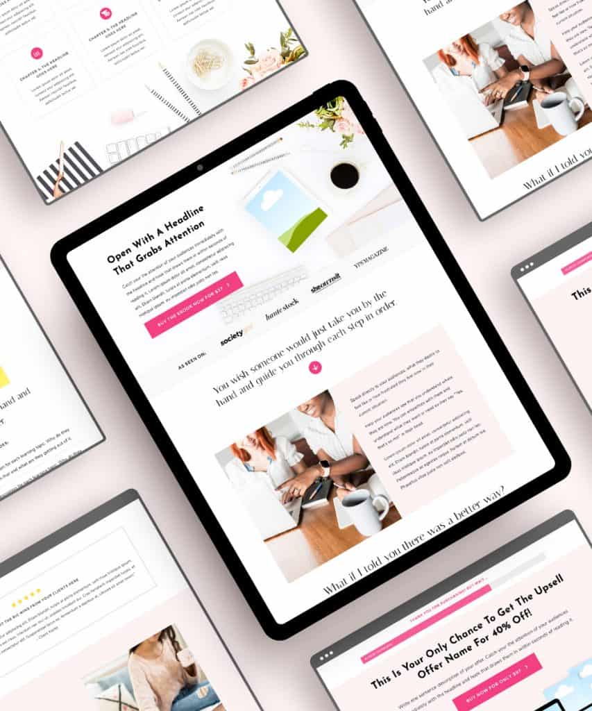
1. Bluchic eBook Launch template
If you’re looking to build a beautiful, feminine sales page for your eBook, Bluchic has got you covered.
This wonderful bundle comes with a:
- Sales Page template
- Upsell Page template
- Thank you Page template
Meaning it’s your one-stop solution to creating all the pages you need for your eBook launch.
It’s compatible with WordPress and you can use the drag-and-drop builder to build your own eBook sales page. They come with easy step-by-step instruction tutorials and videos so that you can set it up asap. Check it out here.
2. eBook Mockup
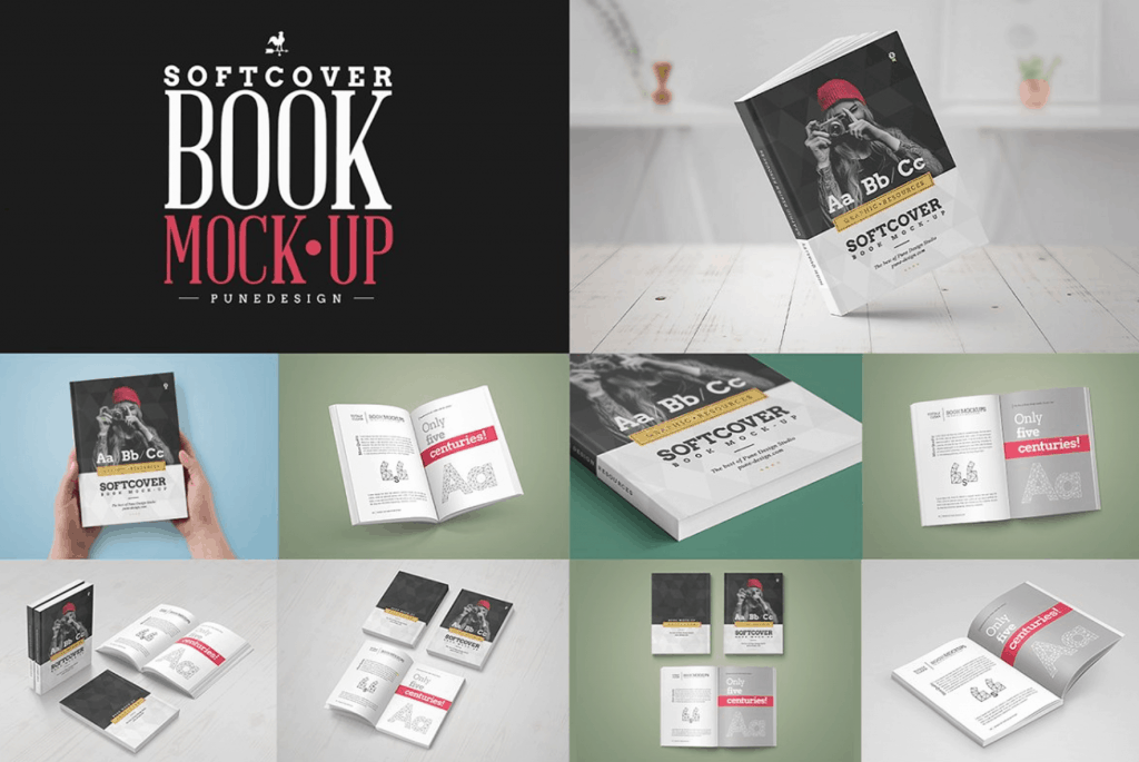
Remember how I mentioned that you needed mockups to showcase your eBook? This is one of the prettiest eBook mockups I’ve found and used till now.
3. SendOwl
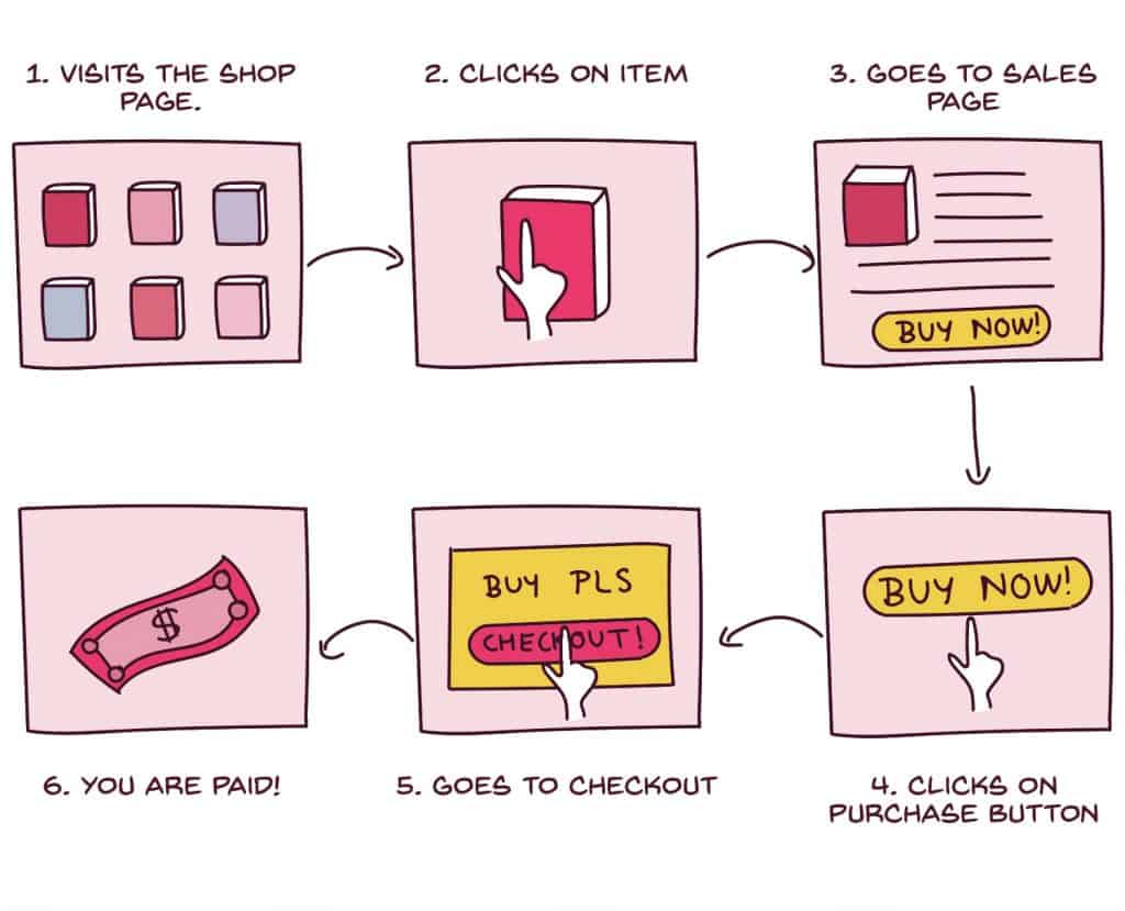
SendOwl allows you to sell digital products online and immediately allows the customer to download the file once the payment has been made. This is how it works.
I started with a free trial when I started my online shop and hopped onto the paid plan immediately because I adored the product. I have a lot of products on SendOwl. And SendOwl has a very easy-to-use and friendly user interface that anybody can use.
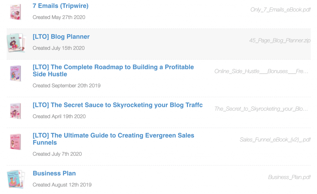
It integrates with PayPal and Stripe for easy checkout! And I love how seamlessly it integrates with ConvertKit as I’m able to tag people as soon as they purchase my products and add them to corresponding sequences.
Unlike most other platforms that take a cut from each transaction, SendOwl takes a standard monthly fee. There are no transaction fees whatsoever. I have looked into a lot of alternatives, but I have found SendOwl to be the most cost-effective one.
If you’re on their premium plan, you will get access to their Affiliate Dashboard. Meaning people can sign up to be your affiliates and they will each get a unique affiliate link to your eBooks that they can promote in their blogs and emails.
It’s a really good way to increase your reach and make more sales.
Take the free Send Owl trial here.
In a nutshell:
Building a sales page is no easy task. It requires a lot of thinking. Following the template I’ve given, will make writing your sales page super easy but use your voice to make your brand stand out.
Be distinctive. Be charming.
The best way to win people over is to be yourself.
And once you create your sales page, you can keep tweaking it each month or quarter to test the conversion rate. All in all, building a sales page shouldn’t feel daunting. It should feel like a fun workout!
Here are a few more related posts to enhance your learning:
- 7 Deadly eBook Mistakes I made + How I fixed it
- The Ultimate Guide to Building a Sales Funnel to automate your Blog Income!
- How ConvertKit brings me over $600 every month!
Now tell me, are you ready to write your sales page? If not, what’s hindering you? Let me know, and I will help you out!

Angela, I’ve purchased three of your ebooks in the last few days — I can’t get enough! Also, your SendOwl recommendation is on point. I love using it now that I’m setting up my sales funnel on my new blog. Thanks again for the awesome content!
Hey Lydia,
You’re very kind. :) I’m glad you’re loving the eBooks and SendOwl, I wouldn’t replace it with anything else. And best of luck with your new sales funnel! I feel it’s going to be amazing!
Lots of love,
Angela
I Angela, I just finished reading your sales funnels book and I’m super excited to implement everything I learned :D I love that your posts are so detailed!
Hey Natalie,
So good to hear from you again. I’m so happy you loved the book. Please feel free to email me or leave a comment with any questions or doubts you have. I’ll clear it right away.
Lovely post! =)
I just finished drafting and editing my mini-eBook I’m offering as a freebie. Is it usually good sales etiquette to include a sales page for my next eBook that I plan on selling on Amazon? Thank you in advance.
Okay, that’s neat. I didn’t understand – a sales page for the next eBook? You mean like a blurb or something? If the eBook isn’t out, how will you make a sales page? Are you talking about pre-orders?
Oh sorry, I wasn’t explaining it very well. Let me rephrase: Is it usually okay to include a sales page (for an eBook I plan on selling on Amazon) in a freebie? In my case, my mini eBook? And how long does it usually take you to finish an eBook on average?
Oh yes! Of course – that’s how you market the eBook. I have purchased so many books from authors like this because I see the “You may also like” and the even include the first chapter for free so that people can get a feel of the book.
It depends – since mine are tutorials and are 300+ pages with screenshots, links, etc, it takes over a month to refine the book. I also do a lot of heavy marketing and blog posts so that takes a bit of time.
Warm regards,
Angela