Hey, buttercup,
My name is Angela Vaz. I’m a 32-year-old Illustrator and Blogger who specialises in building and running profitable websites.
I genuinely love drawing and writing – so building websites from scratch, and writing posts on them (all in a specific niche) brings me joy. I have been blogging since 2018 and I make a full-time income with my multiple niche websites. I recently sold my drawing website (with over 200 blog posts) for 5 figures.
And I say all this because I believe in earning your trust.
In the middle of my coaching session last month, my client told me she was struggling with Pinterest.
We had already gone over her basic Pinterest strategy but she was still not getting clicks and blog traffic.
I took a look at her pins and asked her to make a few tweaks – I even gave her a few templates because she wanted to speed up her success.
And within 1o days of using her NEW pins, she made 2 eBook sales and 1 Amazon Affiliate sale. She was stunned.
If you’re in the same boat, don’t feel discouraged.
Designing pins isn’t a skill we’re born with.
It’s something we have to learn – and it takes time.
But here are some signs that your pins aren’t getting people’s attention:
- You pin consistently, but nobody is clicking on your pins
- You’re getting impressions but no clicks
- You’re getting engagement but people aren’t clicking to your website
And that’s why I am writing this post – to help you create clickable pins.
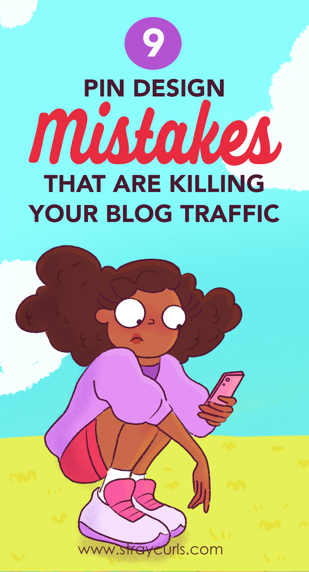
So, here are 9 pin design mistakes you might be making that are costing you the click!
I’ll also highlight my own examples because I don’t want to use other people’s pins as bad examples – that’ll make me a meanie pie.
But before that quick:
Please note: My posts are long, but this is only because I want to make everything super easy for you to understand.
This post may include affiliate links, which means clicking on them might result in me making a commission at no extra cost to you. This allows me to run this blog ad-free and make content accessible for you for free. I also use this to pamper my beloved pups.

1. Your text is too small or unreadable
Okay, here are a few things you need to know about Pinterest’s users:
- Most people can’t see that well (I myself wear big nerdy glasses and am practically blind without them)
- Most people use phones – this means that your pin text really needs to be BIG and stand out
- People like BIG LETTERS (remember how your dad/mom squints at the phone when you ask them to read something)
- People like easy-to-read text
Here are 2 examples of a pin with small and large text: Which one is more clickable my sweet?
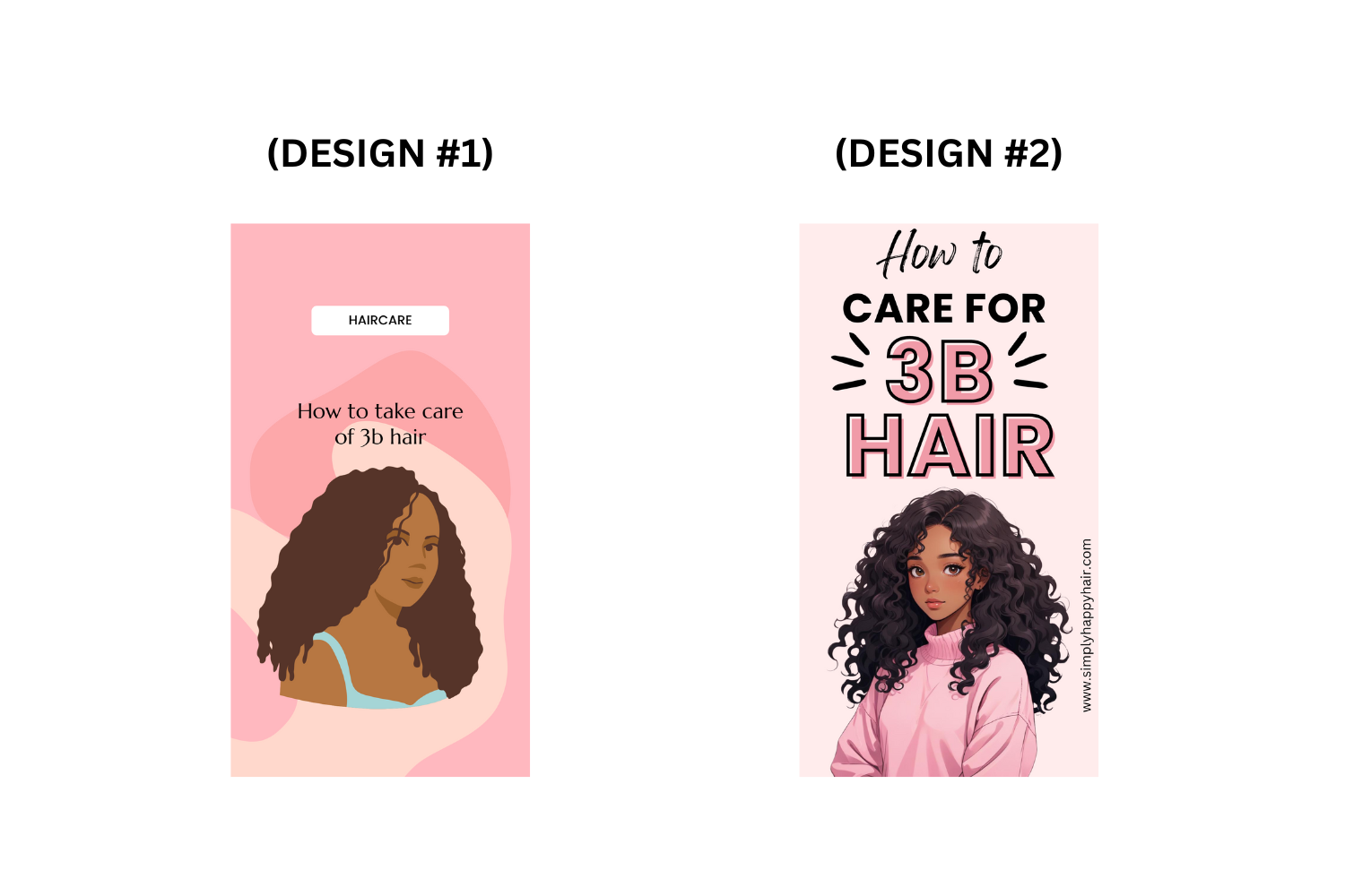
The second one, right?
That’s because the letters are NICE and BIG.
Remember, Pinterest is a visual search engine – people want pretty pins.
They want to be enticed to click.
So, the next time you’re making a pin – remember to make sure that:
- The text on the pin is big and readable
- Your fonts are easy to read (Don’t use thin fonts, avoid script fonts – instead use BIG BOLD letters in a Sans Serif Font)
- You have a good contrast between the text and the background – black on white is best.
2. The colors and branding are meh
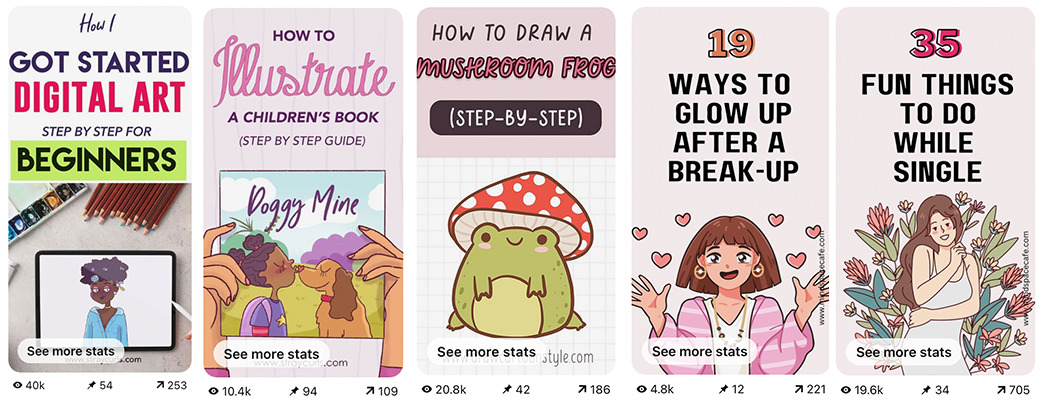
Warm colors do very well on Pinterest.
This means reds, pinks, and oranges do better than greens and blues. Even if I go with purple, I choose a bright, warm purple instead of a dark willowy one.
I have tested out this particularly theory in multiple niches – drawing, hair, cooking, finance, etc.
It doesn’t matter what niche it is, bright, warm pins do best.
This is why most of my viral pins are warm.
Dull or unappealing color schemes don’t stand out on Pinterest’s bright and vibrant platform.
Bold, contrasting colors work better to catch attention – trust me, I am an artist.
3. You’re not using negative-emotion pins
Okay, there are two ways to get people enticed:
- Showcase something desirable
- Focus on the problem (be super negative)
Let me explain this further.
Now, positive titles sound like these:
- “7 Easy Ways to Skyrocket Your Blog Traffic with Pinterest”
- “9 Foods to Eat to Clear your Acne”
- “How to Make Time for Yourself as a New Mom”
However, negative titles sound like these:
- “3 Biggest Mistakes Killing Your Blog Traffic”
- “Stop Using These Fonts in Your Pins (Here’s Why)”
- “Why Your Instagram Growth Is Stagnant (And How to Fix It)”
- “The Worst Foods for Clear Skin—Are You Eating Them?”
People love drama – so do I, that’s why I love Desperate Housewives.
My point is, that sometimes you need to do something a little drastic to pull them in.
Now, scroll up and read the title of this post – it drew you in, didn’t it?
You don’t need to do this all the time but one pin in every 5-6 wouldn’t hurt – it’s an excellent way to get the click!
Use words like:
- “Mistake”
- “Fail”
- “Stop”
- “Wrong”
- “Avoid”
- “Deadly” Pair these with a subtitle saying “+how to fix it!”
You can also do this without using any of these words.
Here’s an example:

NOTE: Use A/B testing on Pinterest to try different colors, fonts, and images to see what grabs attention. What works for one niche may not work for another, so testing is one extra step you can take.
4. Your aspect ratio of the pin is wrong
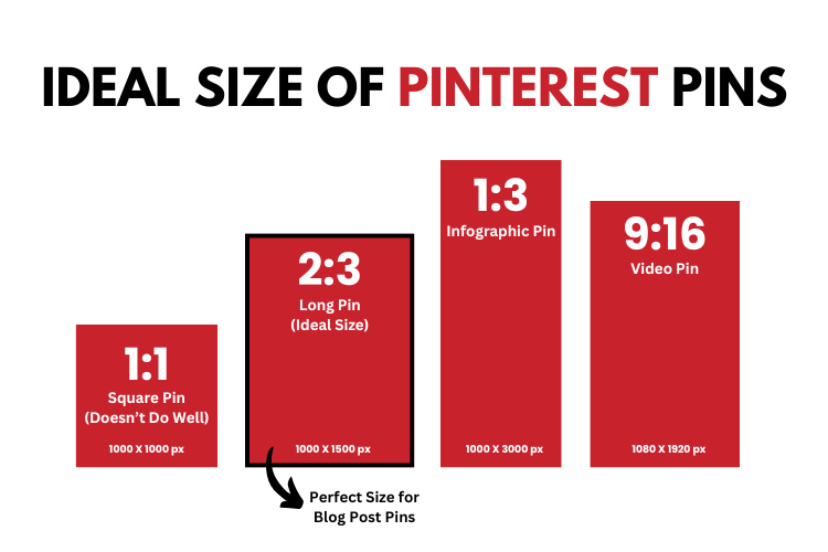
Pinterest doesn’t like horizontal pins or square pins.
They prefer long pins – vertical pins with a specific aspect ratio of 2:3
Think of those long ancient scrolls people used back in the Middle Ages.
They were so easy to read.
That’s what you need to remember when you’re making pins.
When creating pins, you can use the following aspect ratios:
- 600px X 900px
- 1000px X 1500px
- 1000px X 1850px
I personally use the third option because I like to create little longer pins.

Don’t make your pins too long unless they’re infographics.
Pins that are too long might get truncated in the feed, meaning users won’t see the entire image unless they click to expand it.
This might mean lesser engagement.
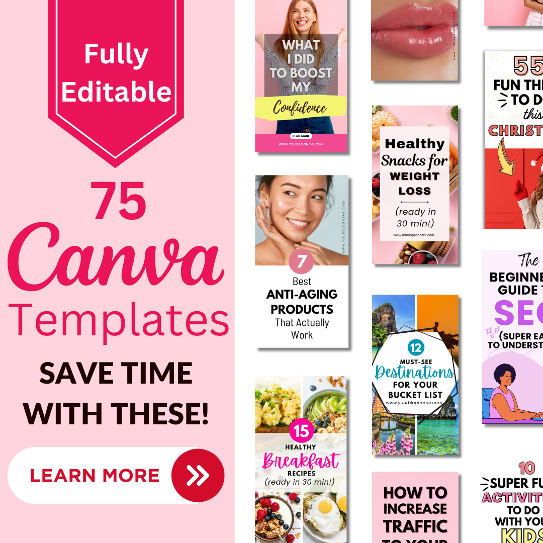
If you’re struggling to make good pins, why not get my personal Pin Templates? I actually have tried and tested this on my websites and they’re extremely high-converting, eye-catching, and get a lot of clicks!
5. Your titles aren’t attention-grabbing or click-worthy
I don’t mean any offense when I say this.
But a lot of bloggers are very factual, and in order to do well on Pinterest, charisma is needed.
It’s the missing ingredient.
Let me give you an example, which of these titles do you prefer:
- Delicious Tofu Burger Recipe
- Juicy Homemade Tofu Burger Recipe with Secret Sauce (Ready in 20 Minutes!) Click to Read
I don’t know about you, but the second one actually made me go prepare a burger.
Give me 10 minutes to finish this…
Why did the second title work though?
- Descriptive and Specific: It tells the user exactly what they’re getting—juicy burgers and a special sauce, which piques curiosity.
- Time frame: Adding “Ready in 20 Minutes!” gives a clear prep time that will attract college kids and busy moms.
- Keyword-rich: It includes keywords like “homemade burger recipe” and “secret sauce” that people might search for on Pinterest.
6. The image isn’t attention-grabbing
So, earlier, I used to simply use stock photos on my pins and end it with that.
Now, however, I add little graphics over the stock photos to add more oomph to the Pin.
And it gets more clicks. Sometimes, I’ll use an illustration and just add some more graphics: 
I just created this pin a week ago – note the little red angry crosses I added to show the anger and frustration between the 2 friends.
This post is very old – but this is a fresh pin and it worked, it started bringing in traffic to the post.
You can use this strategy even on photos.

You’ll note that I added some lines around the lips – this brings more attention to the photos – also note the lines around the number – this little tactic draws a LOT OF ATTENTION to pins.
7. You’re not using words your users use
When you blog about a certain topic, you become a pro at your topics.
This means you’ll use words that beginners won’t commonly use.
For instance, as an Illustrator I’d write a post like “How to Use Procreate to Create Digital Illustrations.”
But people on Pinterest don’t know many of these words – they don’t use these kinds of search queries s0 my pin might not pop up for them.
Instead, they might be typing:
- How to draw on my iPad
- How to draw digital art
- How to use iPad to draw
So, better pin titles would be:
- A beginner’s guide to Digital Art – Learn to draw on your iPad
- How to draw digital art – for Newbies
Now the big question is, how do you find out what people search for?
I use a tool that helps you understand what is working on Pinterest so that I don’t have to guess what keywords, pin designs, and pin descriptions I need to use.
This tool shows you:
- Keywords (and related keywords to the topic)
- Top Pins along with saves, clicks, and reactions (you can study the designs of the top pins for a keyword and then create something similar to maximize your traffic)
- Topics that the Top Pins are Ranking For (I look at the top pins using the topics I want to rank for, and then take those keywords and use them in my Pins”
I was initially skeptical because I always think twice before a paid subscription.
But the best part is, that it comes with a 5-day free trial (no need for any credit card information), so I had nothing to lose.
CLAIM FREE 5-DAY TRIAL HERE OF PIN CLICKS
If you’re purchasing a plan, remember to use code StrayCurls25OFF to get 25% off any payment plan you choose!
I loved the trial so I got the annual membership – it was totally worth it – you can also get a monthly membership.
If you don’t use the tool, that’s okay too – you can still use Pinterest’s Inbuilt Search option – it’s just a little harder to see what’s working and what’s not so you’ll have to experiment and do some trial and error.
8. Your pin designs are old and traditional
When I was new to Pinterest and not so familiar with what worked and what didn’t – I created very boring pins that I assumed were wonderful.
I was paying attention to design as a Designer and Artist.
I didn’t realize that Pinterest Users liked big, bold pins.
So, here’s an example of an old pin, and here’s what I would make today:
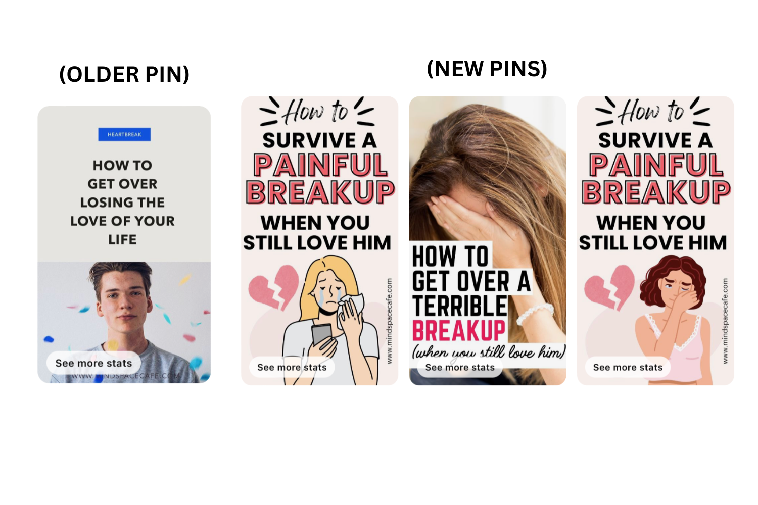
Do you see the difference?
- The pin ratio has been adjusted.
- The fonts have been made bigger and certain words are emphasized
- Graphics and a “heartbreak” illustration has been added
- Pins are warmer – they use more pink and red.
And this is why the second batch of pins will do better.
So, look at your pins and see if you can take them up a notch.
9. You’re not using Pin Titles and Pin Descriptions
Look, Pinterest is still run on algorithms – it’s not human.
Meaning they read the titles and the descriptions to understand what your pin is about and once they figure it out, they assign some annotations to your pin. When someone enters a query in Pinterest search, they’ll show the user pins whose annotations match the query.
So, basically, you need to fill in your Pin Title and Pin Description with related keywords from the post and the pin so that Pinterest can do that seamlessly.
Again, to do this research, you can use PinClicks.
Or just use Pinterest’s Search Bar to understand what keywords to use.
If you’re very tired of writing pin descriptions, you can plug in the keywords to any AI tool and ask it to write a pin description for you. I personally don’t do this because I like writing them, but this is a time hack that you can use.
Doing this will seriously help you rank for more keywords and queries and get you more “exposure.”
It also showcases you as an Expert and users will more likely click on your pin compared to someone who doesn’t have these filled out.
And that brings me to the end of my list.
If you enjoyed this post, subscribe to my newsletter by getting these free Pinterest templates.
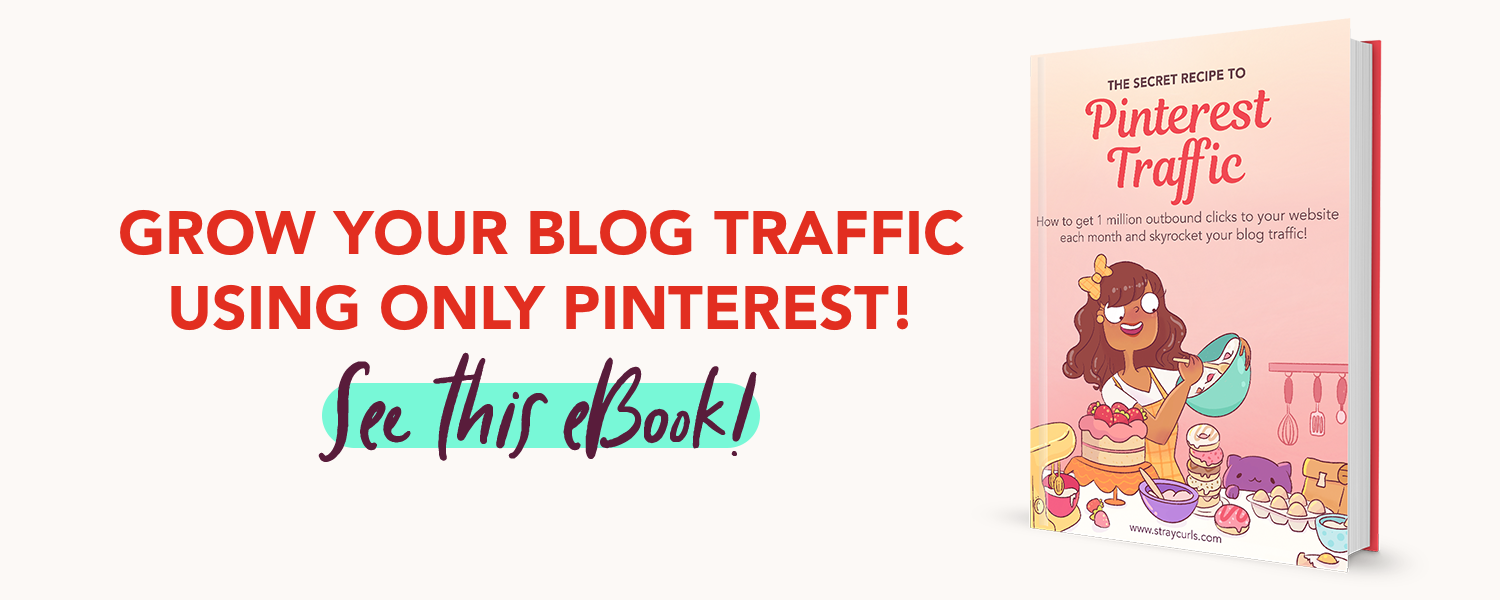
And check out my eBook if you’re serious about Pinterest and want to get Pinterest traffic to your blog:
Just to recap:
- Use large fonts – preferably sans-serif fonts. Avoid script fonts.
- Use bright, warm colors – think pink and red.
- Keep your pins in a 2:3 size ratio.
- Write an attention-grabbing title
- Use images that invoke curiosity or make them want to click
- Add little graphics to draw more attention to the pin
- Use words your readers would use
- Use a good pin design
- Remember to include keywords in Pin Titles and Descriptions
For now, here are all my blog posts related to Pinterest to help you:
- 7 Pinterest Hacks Nobody is Talking About
- How to Use Pinterest as a Blogger in 2024
- My honest review of PinClicks after using it for 6 months
- How to grow your email list using Pinterest
- How Pinterest is making me over $3K a month
- How many times can a URL be shared in 1 day?
- What to do if someone steals your pin?
- How to find Pinterest keywords for your blog
- How to use PinClicks to create a viral pin design
can’t wait to implement this amazing tips
I’m so glad you loved it – I have a lot more lined up for the next few weeks. =)
Loved all of this!! I feel excited already. Thank you so much, Angela 🤗
You’re welcome. And your excitement is rubbing off on me – I’m excited too! :D
That illustration of you and your dogs is so beautiful!
You are so sweet, Maria – thank you. =)
Thank you for this post Angela, I was missing your newsletter and finally, it came up with a new post, that too a super helpful one! I am working seriously on Pinterest these days (as per your advice) and it is working for me. Slowly & steadily but its working and I am excited to work harder on it. Your post has motivated me further. I have observed and learnt that looking for trends and festivals on Pinterest also helps in getting better impressions and clicks. Just don’t ever stop helping us all in this blogging journey, Kudos!
Hey Pratishtha,
Thank you for always leaving such precious comments on the blog. I really appreciate it. I took my time away because I was researching this whole Google fiasco and I desperately wanted to find a solution before I started writing on it. I don’t believe in peddling advice unless I actually can back it up with proof and experience. So, now that I’ve finally found something working for myself and my clients – I want to share it with everyone here so that they can grow that their traffic and recover from all these Google Updates.
I have a lot more content lined up for the next few months, so I’m pretty excited as well! :D Oh yes, Pinterest Trends are working beautifully! I’m so glad you’re seeing results too!
Lots of love,
Angela
Awesome! That’s why your readers trust you so much. Can’t wait for the upcoming content!
Awwww, thank you. You always say the sweetest things. And your timing couldn’t have been more perfect – I just published a new post! I hope you love this one too. :) https://www.straycurls.com/how-to-find-pinterest-keywords-skyrocket-your-blog-traffic/
Is it possible for you to design my pins? Do you offer a package like that? I’d really like that.
Hey Anna,
I don’t design pins, but I am releasing some templates soon, so those should be useful! :D I can also help you with your designs by examining your pins and telling you what you could change. Let me know if that’s what you’d like.
Warm regards,
Angela
Just got your templates, omg, they’re so easy to use! Thank you so much for this!
You’re very welcome Chloe, so glad you love the templates. =)